Biography
Contact
Biography
Contact
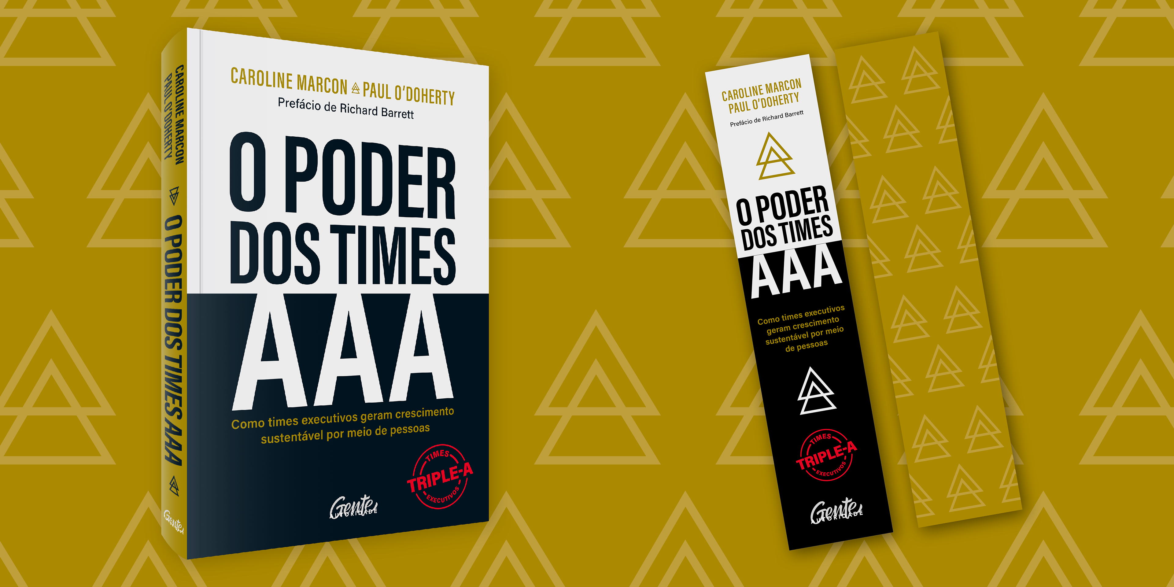
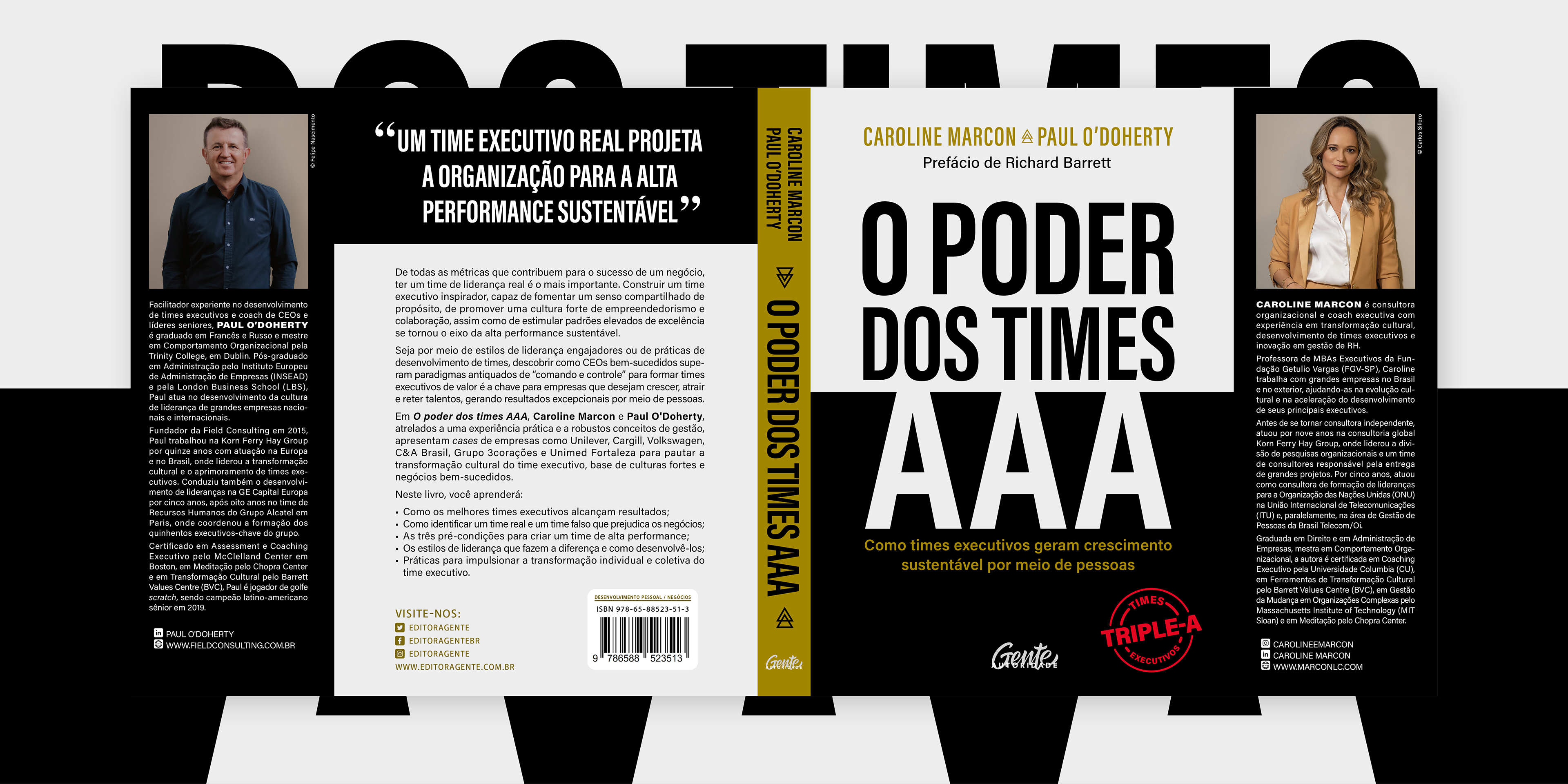
/ o poder dos times aaa
O poder dos times AAA
Format:
Book
Publisher:
Editora Gente
Year:
2023
Scope of Work:
Cover design
Software:
Adobe InDesign, Photoshop
↑
Back to Top